


Did you know that 70% of top color combos include warm tones like red, orange, and pink1? This fact shows that people love bold, vibrant pairings. Patterns and solids offer endless ways to create stunning outfits and decor. This guide will show you how to master pattern-solid mixing, making your style stand out.
Whether you love monochromatic designs or enjoy the drama of color blocking, knowing how to mix patterns is essential1. By learning about pattern-solid pairings, color theory, and balance, you’ll create looks that show confidence and style.
Table of Contents
- 1 Understanding the Basics of Pattern and Solid Color Combinations
- 1.1 The Psychology Behind Pattern-Solid Pairings
- 1.2 Relatedarticles
- 1.3 10 Creative Ways to Incorporate Texture & Pattern for Depth and Visual Interest in Your Décor
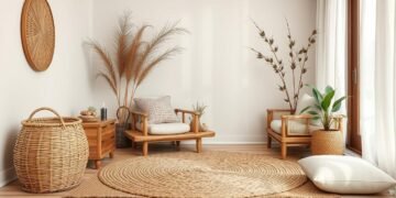
- 1.4 From Flat to Fabulous: 5 Ways Textured Rugs Bring Depth and Style to Interior Design
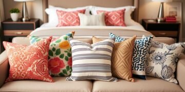
- 1.5 7 Accent Pillow Patterns That Elevate Any Sofa or Bed in Your Home
- 1.6 The Role of Balance and Proportion
- 2 Stripes: The Timeless Pattern for Solid Color Enhancement
- 3 Floral Patterns With Solid Backgrounds: Creating Depth and Interest
- 4 Geometric Designs: Adding Structure to Solid Colors
- 5 Patterns with Solid Colors: Essential Design Principles
- 6 Animal Prints: Bold Statement Patterns for Neutral Solids
- 7 Polka Dots and Circular Patterns: Playful Yet Sophisticated
- 8 Ethnic and Global Patterns: Mixing with Monochromatic Schemes
- 9 Chevron and Herringbone: Dynamic Partners for Solid Hues
- 10 Damask and Traditional Patterns: Elegant Solid Color Companions
- 11 Plaid and Checkered Patterns: Structured Style with Solids
- 12 Conclusion
- 13 FAQ
- 13.1 What are the common pattern types that pair well with solid colors?
- 13.2 How does color theory play a role in successful pattern mixing with solids?
- 13.3 What design principles should be considered when combining patterns and solid colors?
- 13.4 How can stripes be used to enhance solid color schemes?
- 13.5 What are some tips for using floral patterns with solid backgrounds?
- 13.6 How can geometric patterns add structure to solid color schemes?
- 13.7 What is the role of animal prints when combined with neutral solid colors?
- 13.8 How can polka dots and circular patterns add a playful yet sophisticated touch to solid-color interiors?
- 13.9 What are the benefits of incorporating ethnic and global patterns with monochromatic designs?
- 13.10 How do chevron and herringbone patterns interact with solid hues?
Key Takeaways
- Warmer tones like red, orange, and pink dominate the most popular color combinations1.
- Mixing patterns requires a balance of scale and intensity to avoid a cluttered look2.
- Incorporating a pop of color with a neutral shade is a popular trend for creating impactful outfits1.
- Monochromatic looks offer a timeless and versatile approach to pattern mixing1.
- Combining solid blocks of color is a modern and bold way to approach pattern-solid pairings1.
Understanding the Basics of Pattern and Solid Color Combinations
As a designer, I’ve learned how powerful pattern and solid color combinations are. They can bring harmony, contrast, and depth to any space3. Geometric patterns, like pinstripes and bold bands, and designs like houndstooth and plaid, add to this mix. Floral patterns, from delicate to bold, also play a big role.
The Psychology Behind Pattern-Solid Pairings
Understanding color theory is key when mixing patterns and solids4. A color wheel shows how colors relate to each other. Complementary colors, opposite each other, make each other pop. Mixing them can make both duller.
Analogous colors, next to each other, create a smooth palette. Triadic colors, three hues apart, add excitement. Tints, shades, and monochromatic schemes also matter in pattern mixing4. Adding white makes colors lighter, while black deepens them. A single color can be very striking.
Warm and cool colors also have a psychological impact. They can change the mood and feelings of a space.
The Role of Balance and Proportion
Balance and proportion are key when mixing patterns and solids4. Contrast and range keep things interesting. Designers like Martha Stewart and Steve Cordony use minimal patterns to highlight art and architecture.
Learning color theory and the psychology of pattern-solid pairings is the first step. By focusing on balance, proportion, and creative use of colors, designers can create stunning spaces. These spaces perfectly blend pattern and solid color.
Stripes: The Timeless Pattern for Solid Color Enhancement

Nautical stripes are a classic choice in interior design. They add a timeless and versatile look that goes well with solid colors. Whether it’s classic black and white or bold gradient patterns, stripes and solid colors create stunning contrast and depth5.
Stripes are great at making solid colors pop. Wide stripes make a big statement, while vertical stripes can make a room seem taller5. Striped rugs and carpets also help tie a room together5.
When combining striped textiles with other patterns, balance is key5. Adding striped lighting fixtures can also add flair to a room5.
Stripes are not just about looks; they can also make a space feel bigger. Wide stripes work well in large rooms, while smaller stripes are better for cozy areas5. Mixing different stripe widths or directions can add depth and interest to your decor5.
Choosing classic stripe designs and colors is important to avoid a dated look5. Vertical stripes can make ceilings seem higher, while horizontal stripes can widen a room5.
“Stripes have a way of elevating even the most basic of solid colors, creating a timeless and sophisticated look that can be tailored to any aesthetic.”
Stripes can add a bold nautical vibe or a more refined, gradient look. They are a versatile pattern that can enhance solid colors and improve any space’s design6.
Floral Patterns With Solid Backgrounds: Creating Depth and Interest

Floral patterns have been loved in interior design for centuries. They fit many styles, from bohemian chic to minimalistic7. When paired with solid backgrounds, they add depth and interest, making a space look better.
Traditional Floral Motifs
Traditional floral patterns bring timeless elegance to rooms7. Designers like Mario Buatta and Colefax & Fowler use these classic designs. They look great on pillows, draperies, and small upholstered pieces8. Chintz, a glazed floral fabric, adds classic charm too.
Modern Botanical Prints
Bold and graphic floral prints bring a modern touch7. These designs, with big blooms in bright colors, can be a focal point or add whimsy7. Use them on wallpapers, decals, and upholstery to decorate a room.
Seasonal Floral Applications
Floral patterns can show off the seasons, making a space feel fresh and welcoming7. Use throw pillows, curtains, or artwork to change your decor with the seasons.
When using floral patterns with solid backgrounds, keep colors consistent and play with sizes for interest8. Adding textures, like textured wallpaper or woven fabrics, adds depth8. The goal is to balance bold patterns with solid backgrounds for a stunning and harmonious look.
“Mixing patterns and textures is considered one of the most powerful tools in interior design.”8
| Floral Pattern Style | Design Application |
|---|---|
| Traditional Floral Motifs | Pillows, Draperies, Upholstery |
| Modern Botanical Prints | Wallpaper, Decals, Upholstery |
| Seasonal Floral Accents | Throw Pillows, Curtains, Artwork |
Geometric Designs: Adding Structure to Solid Colors

Geometric patterns can make your home look amazing. They add structure and interest to solid colors. These designs, from simple shapes to complex patterns, make any room better9.
Geometric patterns bring modern style and elegance. They work well with solid colors, creating a beautiful look. This mix makes your space feel complete and stylish.
Geometric patterns come in many shapes, like squares, triangles, and circles. Each shape has its own meaning. Squares and rectangles are stable, circles are feminine, and triangles are vibrant10.
Using geometric patterns can make rooms look bigger and more open11. Patterns on floors can make a room feel larger. Soft items like curtains and cushions add fun11.
But, it’s important to balance patterns with solid colors. Too much can be overwhelming11.
Whether you love chevron or abstract designs, they can make your space modern and sophisticated911. Let geometric patterns be the heart of your design. They will make your space stand out.
Patterns with Solid Colors: Essential Design Principles

Understanding how patterns and solid colors work together is key. Good pattern harmony comes from knowing about contrast, harmony, scale, and texture12.
Contrast and Harmony
Getting the right mix of contrast and harmony is vital. Too much contrast can make a space feel chaotic. But, the right balance can make it interesting and inviting.
Designers like Ben Pentreath show how to mix colors and patterns well. They use bold colors and patterns with solid textures to create a collected look13.
Scale Considerations
The size of patterns matters when mixing them with solids. Using both big and small patterns adds depth. But, make sure no pattern takes over the room.
It’s important to balance the sizes of patterns and solids. This balance helps create a space that looks good and feels cohesive.
Texture Integration
Adding different textures is also key. Textures like woven fabrics or velvets add depth and interest. Mixing patterns with various textures makes a space look sophisticated and intentional.
Mastering pattern and solid color mixing is about finding the right balance. It’s about contrast, harmony, scale, and texture. By understanding these, you can make your spaces truly special12.
Animal Prints: Bold Statement Patterns for Neutral Solids

Animal prints are bold and eye-catching in the world of patterned textiles. They range from leopard spots to zebra stripes. These designs add excitement to any room when paired with neutral colors14.
Zebras, leopards, and giraffes inspire many animal print designs. They are great for making a bold statement in area rugs14. In traditional settings, a single animal-print piece, like a zebra stripe ottoman, can be a focal point14. Real hide rugs are popular, but they should be placed where they won’t get dirty. Faux-hide rugs are better for busy areas14.
Animal prints can also be used on furniture like side tables and chairs. This adds style and flexibility to any room14. These prints come in many colors, not just neutral ones. You can find bright blue zebra stripes or vibrant patterns for furniture14. Even dining room chairs can be reupholstered with animal prints for a unique touch14.
Animal prints fit into many decorating styles. They work in colorful, eclectic spaces and in more traditional or modern settings14. Whether used as accents or main pieces, they bring drama and sophistication to any room14.
In fashion, animal prints work the same way15. Prints inspired by animals like leopards and zebras are popular in clothes and accessories15. Start with small items like scarves and bags15. Pair them with neutral colors like black or beige for a chic look15. Wear only one animal print item at a time for a cohesive look15. Mixing prints with solid colors or textures adds depth to your outfit15.
Animal prints are bold and exciting in both home decor and fashion. They make a statement when paired with neutral colors. This creates a striking and versatile look that suits many styles1415.
Polka Dots and Circular Patterns: Playful Yet Sophisticated

Polka dots and circular patterns have always fascinated fashion lovers and interior designers. They bring a unique charm that goes beyond trends and time16. These designs first appeared in the mid-1800s in Europe16. They became popular again in the 1950s, thanks to the polka dot bikini16.
High-end designers later added a sophisticated touch to these playful patterns. This made them a staple in fashion.
Circular patterns add elegance and fun to any setting or outfit16. In some Asian cultures, polka dots are seen as lucky and used in special clothes and events16. These patterns inspire designers in many fields, from clothes to home decor16. They can also create a calming effect and add energy to a space.
Size Variations in Circular Patterns
The size of circular patterns greatly affects the look. Big dots make a bold statement, while small ones add a delicate touch. Finding the right size can make the pattern work well with other design elements.
Color Intensity Management
Choosing colors for polka dots and circular patterns is key. Bright colors make the patterns pop, while soft colors create a more elegant look16. These patterns suit both men’s and women’s fashion16. They can fit into many color schemes, making them very versatile.
Polka dots and circular patterns add charm and elegance to any design. By thinking about size and color, you can make striking designs. These elements can make a big impact in any space or outfit.
Ethnic and Global Patterns: Mixing with Monochromatic Schemes

Exploring ethnic and global patterns can transform your home. From Southeast Asia’s ikat designs to Indonesia’s batik prints, these patterns bring cultural richness17. Mixing them with monochromatic colors creates a blend of tradition and modern style.
Ikat’s geometric motifs look great with solid neutrals, adding luxury17. Mandala patterns, with their symmetrical designs, enhance monochromatic spaces with depth17. Batik’s wax-resist technique adds a unique texture, bringing global flair to your decor.
Using ethnic and global patterns in your home is easy18. Choose from bold tropical prints, detailed boho patterns, or serene mandalas. The key is to balance the patterns with solid colors for a stunning look18.
Mixing ethnic patterns with monochromatic colors creates a space that’s both culturally rich and stylish18. This blend lets the patterns stand out while solid colors provide a soothing base. The result is a cohesive and eye-catching design17.
“Ethnic and global patterns are the soulful expressions of diverse cultures, and when woven into monochromatic schemes, they create a tapestry of timeless beauty.”
| Pattern Type | Monochromatic Pairing | Design Effect |
|---|---|---|
| Ikat | Neutral solids | Luxurious and well-curated |
| Mandala | Monochromatic palettes | Depth and visual interest |
| Batik | Monochromatic schemes | Global flair and texture |
| Tropical prints | Monochromatic backdrops | Culturally rich and refined |
| Boho patterns | Monochromatic schemes | Harmonious and visually striking |
Chevron and Herringbone: Dynamic Partners for Solid Hues
![]()
Chevron and herringbone patterns add excitement and depth to any room. Chevron patterns started in 16th-century France19, while herringbone dates back to the Roman Empire19. They’ve been loved for centuries, adorning floors, walls, and furniture in both ancient and modern times.
Chevron patterns bring a sense of grandeur with their continuous V-shapes19. They pair well with solid colors19. Herringbone patterns, with their zigzag blocks, offer timeless charm that matches solid colors19.
Directional Pattern Applications
Chevron and herringbone patterns fit well with many interior styles. Chevron patterns make rooms feel more luxurious by expanding the space visually19. Herringbone patterns add texture and depth, perfect for vintage or traditional designs19.
Space and Movement Creation
These patterns also enhance a room’s feel of movement and depth. Herringbone flooring makes a room look bigger by creating an illusion of space20. Chevron patterns add elegance with their continuous lines19.
Together with solid colors, these patterns boost a room’s design. They add interest and sophistication. Whether you choose herringbone’s classic look or chevron’s bold style, they’ll leave a lasting impact.
Both patterns need regular care20. But their timeless beauty and ability to add depth make them great choices for anyone who loves design.
Damask and Traditional Patterns: Elegant Solid Color Companions

Damask patterns are perfect for adding a timeless touch to solid colors. Traditionally made from luxurious silk, they bring grandeur to any room21. Schumacher’s Chateau Silk Damask in Citron is a great example, making any room look refined and detailed21.
Damask patterns go well with many solid colors, from deep tones to soft neutrals21. They’re ideal for formal spaces, pairing well with floral designs and tapestries21. Adding damask to your decor can make your space look elegant and cohesive.
Other traditional patterns like toile de Jouy and ornate brocades also pair well with solid colors22. These classic designs, with their detailed motifs in soft colors, add sophistication when matched with solid hues22. They can make walls, furniture, or accessories look more refined, taking your space back in time.
By embracing traditional patterns, you can create stunning spaces that mix old and new beautifully. This results in a space that is both harmonious and visually stunning.
Plaid and Checkered Patterns: Structured Style with Solids
Plaid and checkered patterns are timeless classics that add elegance to any room23. They range from small gingham checks to large buffalo plaids. These patterns have a rich history and appeal to both old and new tastes23.
Designers use these patterns sparingly to avoid a too country look. They pair them with solid colors for a balanced, sophisticated look23. For example, a large buffalo plaid can look chic on an English roll armchair, paired with solid colors23.
Plaid adds warmth and tradition to any space23. Gingham is versatile, blending past comfort with modern freshness23. By using these patterns, you can create a harmonious, visually appealing design that captures English cottage style.
When using plaid and checkered patterns, finding the right balance is key23. Mixing these patterns with solid colors creates a dynamic, elegant space23.
The secret to using plaid and checkered patterns is embracing their structured style23. Use them as a base and add solid hues and other elements23. This way, you create a welcoming space that shows off your style and the lasting charm of these classic patterns2324.
Conclusion
Blending patterns with solid colors needs a good grasp of color theory, balance, and proportion. This guide helps you create stunning and balanced interiors that reflect your style25.
But remember, your personal taste matters a lot in choosing patterns and solid colors. Sometimes, going against the rules can result in something truly unique and beautiful25. I suggest trying out different combinations to find what works best for you and your space.
Whether you love stripes, damask, or animal prints, the goal is to find a balance. Knowing how to pair patterns and colors can turn your home into a masterpiece2526.

