


“Color is a power which directly influences the soul,” wrote renowned artist Wassily Kandinsky. He captured the essence of how elegant color choices can transform our living spaces. As a design enthusiast, I’ve found that some classic color palettes are timeless. They create spaces that feel both timeless and deeply personal.
Finding the right timeless color combinations is more than just about looks. It’s about creating spaces that speak to our deepest design sensibilities. Neutrals, blues, and greens are the most enduring hues. They offer a calming and sophisticated backdrop for any interior1. These colors have the power to breathe new life into our homes while keeping them elegant.
Designers have long known the transformative power of carefully chosen color palettes2. Brands like Benjamin Moore and Sherwin-Williams offer color collections that capture timeless design. They give homeowners classic color palettes that stay stylish year after year3.
Table of Contents
- 1 Understanding the Power of Timeless Color Choices
- 1.1 The Psychology Behind Enduring Color Schemes
- 1.2 Relatedarticles
- 1.3 Top 10 Iconic British Colonial Décor Elements to Infuse Classic Style into Your Home
- 1.4 5 Timeless Window Treatments That Will Perfectly Complement Classic Interiors
- 1.5 Bring Charm to Your Home: 6 Traditional Wall Paneling Designs You’ll Love
- 1.6 How Classic Colors Impact Space Perception
- 1.7 The Role of Light in Color Selection
- 2 Classic Color Palettes Through the Ages
- 3 The Elegant Neutrals: Beige, Ivory, and Warm Whites
- 4 Navy Blue and Classic Whites: A Timeless Duo
- 5 Sophisticated Greens and Earth Tones
- 6 Rich Browns and Warm Metallics
- 7 The Black and White Classic Combination
- 8 Tips for Implementing Classic Color Schemes
- 9 Conclusion
- 10 FAQ
- 10.1 What makes a color palette truly timeless?
- 10.2 How do I choose the right neutral colors for my space?
- 10.3 Can I mix different color palettes in one home?
- 10.4 How do classic color combinations impact room perception?
- 10.5 Are there environmentally friendly ways to approach color selection?
- 10.6 How can I add warmth to a neutral color scheme?
- 10.7 What are some timeless color combinations that never go out of style?
- 11 Source Links
Key Takeaways
- Neutrals and blues create the most enduring color schemes
- Classic color palettes transcend temporary design trends
- Personal preference is key in selecting timeless colors
- Professional designers recommend strategic color usage
- Timeless colors can dramatically transform living spaces
Understanding the Power of Timeless Color Choices
Color theory shows how timeless hues affect our feelings and views of spaces. Color harmony is more than looks; it changes places and connects us to our surroundings.
The Psychology Behind Enduring Color Schemes
Colors talk to us without words, reaching our subconscious. Timeless shades bring out certain feelings. The right colors can make a room welcoming, calm, lively, or classy4.
Experts suggest the 60-30-10 rule for color balance. Use 60% main color, 30% secondary, and 10% accent4.
- Neutrals promote wellness and tranquility
- Bold accents add energy and creativity
- Sophisticated monochromatic schemes offer elegance
How Classic Colors Impact Space Perception
Knowing enduring color harmonies makes spaces timeless yet lively. Colors change how we see a room’s size and feel. Soft grays and warm beiges make spaces seem bigger and calmer4.
| Color | Psychological Impact | Space Perception |
|---|---|---|
| White | Clean, Pure | Expansive, Bright |
| Gray | Sophisticated | Neutral, Balanced |
| Blue | Calm, Serene | Peaceful, Depth |
The Role of Light in Color Selection
Light, natural or artificial, changes how we see colors. A color might look great in one light but not another. Designers say to test paint in different lights to pick the best5.
“Colors speak louder than words, telling stories without a single sound.”
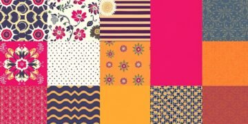
Classic Color Palettes Through the Ages
Exploring historical pigments takes us on a colorful journey through time. Each decade has its own set of colors, showing how design has changed. These colors tell us about cultural shifts and artistic trends67.
Every era’s colors tell a story. From the roaring twenties to today, these colors capture the spirit of their time:
- 1920s: Jewel tones like jade greens and rich reds showed luxury6
- 1930s: Soft colors like seafoam green and pale blue were popular during tough times6
- 1940s: Deep blues and forest greens symbolized the wartime spirit6
- 1950s: Pastels, including Mamie Eisenhower Pink and mint green, were all the rage7
Colors are not just visual elements; they are time capsules of cultural memories.
The story of colors continues through the decades. The 1960s were bright with colors like orange and magenta6. The 1970s loved earthy tones7. Each era’s colors reflect its unique culture, technology, and art8.
Knowing about these colors helps designers and homeowners create spaces that honor design history. By understanding color evolution, we can make interiors that are both timeless and deeply meaningful.
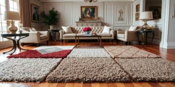
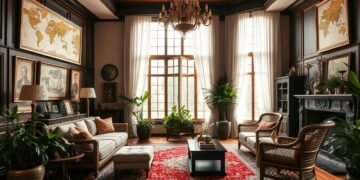
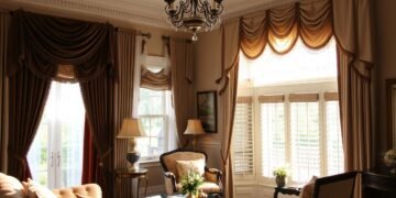
The Elegant Neutrals: Beige, Ivory, and Warm Whites

Neutral tones are a favorite among interior designers for their timeless elegance. Beige and ivory make a sophisticated backdrop that enhances any space with subtle beauty9. These colors, along with soft grays, offer endless design options.
Creating Depth with Layered Neutrals
Layering neutral tones is an art. Mixing different shades of white and cream adds interest. From taupe to soft gray, each shade brings depth and dimension to a room10.
- Blend ivory and beige for a warm base
- Use varying textures to add complexity
- Incorporate light and dark neutral tones
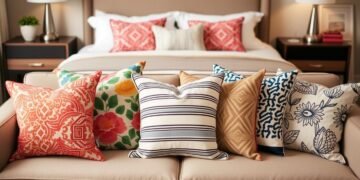
Mixing Textures with Neutral Tones
Texture is key with neutral colors. Mixing smooth and rough textures makes a space inviting. Think linen throws, wool rugs, and ceramic accents that add life to white and cream spaces9.
“Neutrals are not boring – they’re a sophisticated backdrop for creativity.” – Design Expert
Accent Colors for Neutral Bases
While neutrals offer a calm base, the right accent colors can make a space pop. A splash of sage green or deep blue can turn a neutral space into a masterpiece10.
| Neutral Tone | Best Accent Color |
|---|---|
| Soft Beige | Terracotta |
| Ivory | Navy Blue |
| Taupe | Emerald Green |

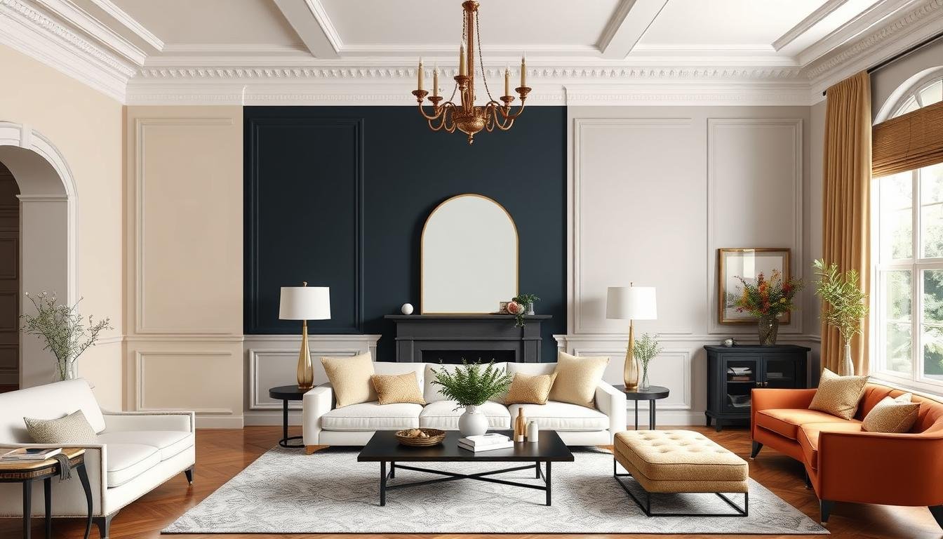
Navy blue and crisp whites make a timeless color scheme. They add effortless elegance to any space. This classic pair brings sophistication, depth, and refinement11.
This color duo is incredibly versatile. It fits perfectly in coastal rooms and modern minimalist spaces12. Designers love how navy blue and white:
- Create visual balance
- Evoke nautical sophistication
- Provide a clean, refreshing backdrop
- Work in both traditional and contemporary settings
“Navy blue is the ultimate neutral that brings depth and character to any space.” – Interior Design Expert
Here are some tips for using this classic color combination:
- Use navy as an accent color in white-dominated rooms
- Create depth with navy furniture against white walls
- Incorporate metallic accents to enhance the palette
- Experiment with different textures to add visual interest
Navy blue and white do more than look good. They also make spaces feel calm and sophisticated11.
Sophisticated Greens and Earth Tones

Green is a powerful design element that brings life to spaces. It ranges from soft olive green to deep emerald green. These colors connect us to nature, turning rooms into peaceful havens13.
Historical Significance of Green in Interior Design
Interior designers have always seen green as a versatile choice. Sage, in particular, became the color of the year in 202114. It’s not just about looks; it also stands for freshness, sustainability, and growth13.
Combining Earth Tones for Natural Harmony
Pairing green with other colors needs a careful touch. Here are some great matches:
- Rust and mustard for a warm, earthy feel14
- Deep navy with terracotta for a striking contrast14
- Soft blues with olive green
Modern Applications of Traditional Green Palettes
Today, green is used in many ways:
| Space | Green Palette Application |
|---|---|
| Nurseries | Soft sage and gentle emerald green |
| Living Rooms | Rich earth tones with green accents |
| Home Offices | Calming green-gray tones |
By using green and earth tones wisely, you can make spaces that are both timeless and modern13.
Rich Browns and Warm Metallics

Interior design loves the luxury of warm browns and shiny gold accents. These elements make spaces feel timeless and sophisticated. Camel and tan tones add a cozy warmth, turning simple rooms into special places15.
Browns have a long history in design, thanks to artists like Rembrandt. They used these colors for depth and shadow in their work15. Today, deep burgundy and warm browns connect us to nature, fitting well with modern tastes15.
- Classic accent colors that complement warm browns include:
- Soft gold metallics
- Creamy whites
- Rich deep burgundy
The warm brown color palette is very flexible. It ranges from light sable to deep mahogany, adding depth and interest15.
“Brown is no longer just a color—it’s a statement of understated luxury and natural elegance.” – Design Experts
| Brown Shade | Characteristic | Design Impact |
|---|---|---|
| Light Camel | Soft and Warm | Creates Welcoming Atmosphere |
| Deep Mahogany | Rich and Dramatic | Adds Sophistication |
| Gold Accents | Metallic Highlights | Introduces Luxurious Dimension |
Modern design sees brown as a sign of organic luxury, fitting into the hipster and natural product trends15. Whether you want a quiet background or a bold look, these colors offer endless design options.
The Black and White Classic Combination
Black and white are the ultimate classic colors for any room. They bring sophistication and drama to any space16. I focus on creating spaces that are both timeless and modern with elegant monochromatic schemes.
Creating Drama with Contrasts
The beauty of black and white is in their contrast. Designers use this contrast to add visual interest17. Here are some ways to do it:
- Use bold black accent walls
- Choose white furniture with black frames
- Mix geometric patterns
- Play with different textures
Balancing Dark and Light Elements
Monochromatic design needs balance. Adding gray tones softens the contrast between black and white16. Wood adds warmth and depth to the design17.
| Color Element | Design Impact |
|---|---|
| Black | Adds drama and sophistication |
| White | Provides brightness and openness |
| Gray | Creates smooth transitional tones |
Adding Warmth to Monochromatic Schemes
To avoid coldness, add:
- Textured fabrics like velvet or wool
- Metallic accents in gold or brass
- Organic elements such as plants or wood
A black and white palette is not about limitation, but about creative expression.
By carefully adding elements, you can make a black and white space inviting17.
Tips for Implementing Classic Color Schemes
Designing with classic color palettes needs a smart plan to make spaces look amazing. Most good color schemes mix different colors well and think about the room’s look18. 80% of pro designers use similar or single-color base palettes with contrasting accents for a balanced look18.
Here are key tips for finding color palette inspiration:
- Test large paint samples in different lighting conditions
- Consider existing furnishings and architectural elements
- Balance warm and cool color contrasts
- Use accent colors strategically
Classic color palettes usually have five chosen colors18. For example, Mediterranean designs mix warm and cool tones like navy, yellow, coral, white, and steel blue19. This mix adds depth and interest while keeping the look timeless.
“Color is a power which directly influences the soul” – Wassily Kandinsky
My best advice is to step back and check your color scheme. Aim for harmony, not perfection. Some designers get ideas from nature, picking colors that go well together18.
| Color Scheme Type | Characteristics | Best Use |
|---|---|---|
| Analogous | Colors adjacent on color wheel | Subtle, cohesive spaces |
| Complementary | Colors opposite on color wheel | Bold, dynamic areas |
| Monochromatic | Variations of single color | Elegant, minimalist designs |
Remember, classic color schemes tell a personal story in your space. Don’t hesitate to try new things and follow your design sense.
Conclusion
As someone who loves interior design, I’ve learned that timeless colors are more than looks. They’re a smart way to make spaces that last. Exploring classic color palettes shows us that good design goes beyond what’s trendy20.
Colors play a huge role in how we feel about a product, making up 62% to 90% of our subconscious judgment20. This shows how important it is to choose colors wisely.
The right color palette for traditional interiors is all about being flexible. Knowing about color models like RGB and CMYK helps designers make spaces that feel both new and classic20. Using monochromatic and complementary colors is a smart way to make spaces that look great and stay appealing20.
Staying true to enduring color trends means some design ideas are always good. Whether it’s inspired by old art or new interior ideas, the right colors can change a room. My color theory journey has shown me that choosing timeless colors is about more than looks. It’s about making spaces that tell stories, stir feelings, and last forever.
Learning about classic color palettes is like mastering a fine art. It’s about mixing personal taste with timeless design. By using these color strategies, we can make spaces that feel both welcoming and new, exciting and inviting.
FAQ
What makes a color palette truly timeless?
How do I choose the right neutral colors for my space?
Can I mix different color palettes in one home?
How do classic color combinations impact room perception?
Are there environmentally friendly ways to approach color selection?
How can I add warmth to a neutral color scheme?
What are some timeless color combinations that never go out of style?
Source Links
- What are the most timeless colors in interior design? 6 ways to create a color scheme that never dates
- 5 timeless paint colors that will never go out of style
- 15 Timeless Paint Colors You’ll Never Tire Of, According To Designers
- Choosing the Right Color Palette | Cleaning & Maintenance Management
- 15 Timeless Paint Colors You’ll Never Tire Of, According To Designers
- Popular Color Palettes Through the Decades: 1920s-1960s | Dunn-Edwards Paints
- Popular Color Palettes by Decade — Onyx Creative
- Most popular colors through the decades: 1920s – 2020s
- The Best 15 White Beige Color Palette Combinations
- Neutral Colors for Each of the 16 Color Types | 16 Palettes of Neutral Colors
- The Best 15 White Blue Color Palette Combinations
- Colors that complement blue : 29 timeless combinations for every room in your home
- 25 Green Color Palette Combinations
- Earth Tones Are Trending — 13 Color Palettes We Love | Havenly Blog
- How to Design with Brown Color Palettes: What Colors Go With Brown?
- The Best 15 White Black Color Palette Combinations
- Black and White – How Modernize This Classic Color Combination
- How I Put Together a Coherent Colour Palette
- The Best 15 Classic Color Palette Combinations
- Color Theory And Color Palettes — A Complete Guide [2025]


